 Lorem ipsum dolor sit amet, consectetuer adipiscing elit. Aenean commodo ligula eget.
 Lorem ipsum dolor sit amet, consectetuer adipiscing elit. Aenean commodo ligula eget.
 Lorem ipsum dolor sit amet, consectetuer adipiscing elit. Aenean commodo ligula eget.
 Lorem ipsum dolor sit amet, consectetuer adipiscing elit. Aenean commodo ligula eget.
 Lorem ipsum dolor sit amet, consectetuer adipiscing elit. Aenean commodo ligula eget.
 Lorem ipsum dolor sit amet, consectetuer adipiscing elit. Aenean commodo ligula eget.
 Lorem ipsum dolor sit amet, consectetuer adipiscing elit. Aenean commodo ligula eget.
 Lorem ipsum dolor sit amet, consectetuer adipiscing elit. Aenean commodo ligula eget.
 Lorem ipsum dolor sit amet, consectetuer adipiscing elit. Aenean commodo ligula eget.
Module Above Content
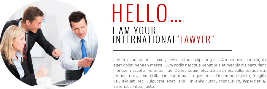
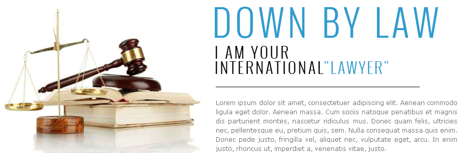
 Lorem ipsum dolor sit amet, consectetuer adipiscing elit. Aenean commodo ligula eget dolor. Aenean massa. Cum sociis natoque penatibus et magnis dis parturient montes.
JP-Lawyer
Another responsive template for Joomla that can be used for any business due to its clear design. The template layout adjusts to small screens of any mobile devices. The template setting allows to configure lots of parameters like fonts, colors and more. The Theme is using a responsive 12 column Grid Framework with Responsive Layout. Resize your Browser and test the amazing responsive Layout with the special I-Phone Tabmenu.
The Template has a lot of different Layout and Color Options and all modifications can be made via Joomla backend Template Parameters.
 Responsive 12-Column Grid Layout
This Template was build with a responsive 12-column grid. We've also included fixed- and fluid-width layouts based on that system.
This Theme was made to not only look and behave great in the latest desktop browsers (as well as IE7!), but in tablet and smartphone browsers via responsive CSS as well.
A 12-column responsive grid, dozens of components, javascript plugins, typography, form controls, and even a web-based Customizer
 Lorem ipsum dolor sit amet, consectetuer adipiscing elit. Aenean commodo ligula eget.
 Lorem ipsum dolor sit amet, consectetuer adipiscing elit. Aenean commodo ligula eget.